The Applicant Portal is a platform where banks, businesses, and individuals collaborate on loan applications. Originally built for straightforward lending workflows, the product began to break down as commercial deals grew more complex, which slowed transactions, strained partner relationships, and limited expansion into higher-value lending segments.
Led UI/UX design and prototyping across desktop and mobile
Partnered with another designer focused on information architecture, while iterating closely with stakeholders
Initial design & discovery phase: 3 months
Development: Ongoing
Contributed to stronger partner confidence and eventual integration into Moody's ecosystem following acquisition
Supports complex loan structures that the original system could not
The existing portal was successful for handling straightforward loans, but it broke down for larger, more complex scenarios. Key limitations included:
- An inflexible information structure that made complex loans difficult to manage
- Information architecture that mirrored backend relationships rather that user intent, leading to confusing navigation
- Limited collaboration features between applicants and banks, introducing friction
- Poor adaptability for mobile use, leading to hidden elements
Old Information Architecture
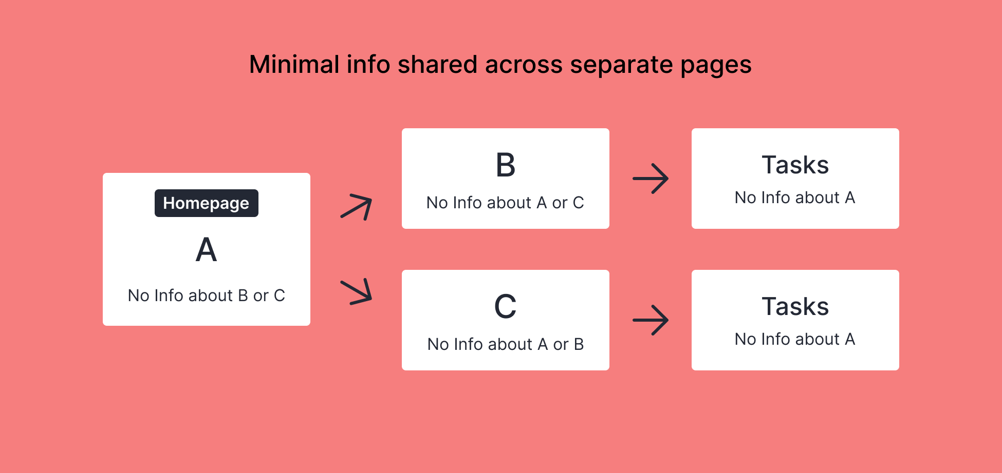
A, B, and C represent the loan and its related components
Stakeholders prioritized demonstrating that the redesigned platform could support complex loan structures and relationships. Early concepts leaned into:
- Surfacing relationships between loans, entities, and tasks
- Exposing more structural context up front
- Emphasizing scalability and flexibility
This direction helped build confidence with strategic partners and reinforced the platform’s ability to support more sophisticated lending workflows. However, optimizing for system complexity introduced a new problem:
Most users didn’t need to understand the system - they just needed to know what to do next.
Most sessions involved only 1-3 meaningful actions. Users were slowed by an interface that required navigating loan structures before reaching their tasks.
Users don’t experience a complex loan - they experience the next task.
Initial complex information architecture
A, B, and C represent the loan and its related components
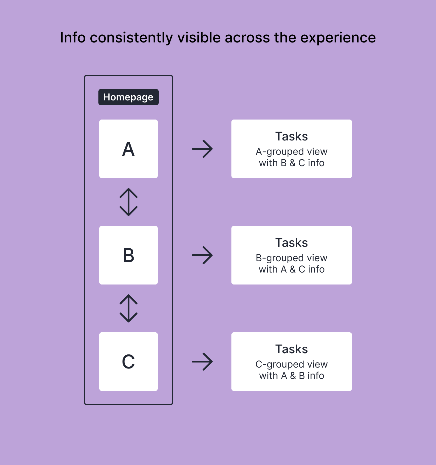
Initial redesign - exposing relationship complexity
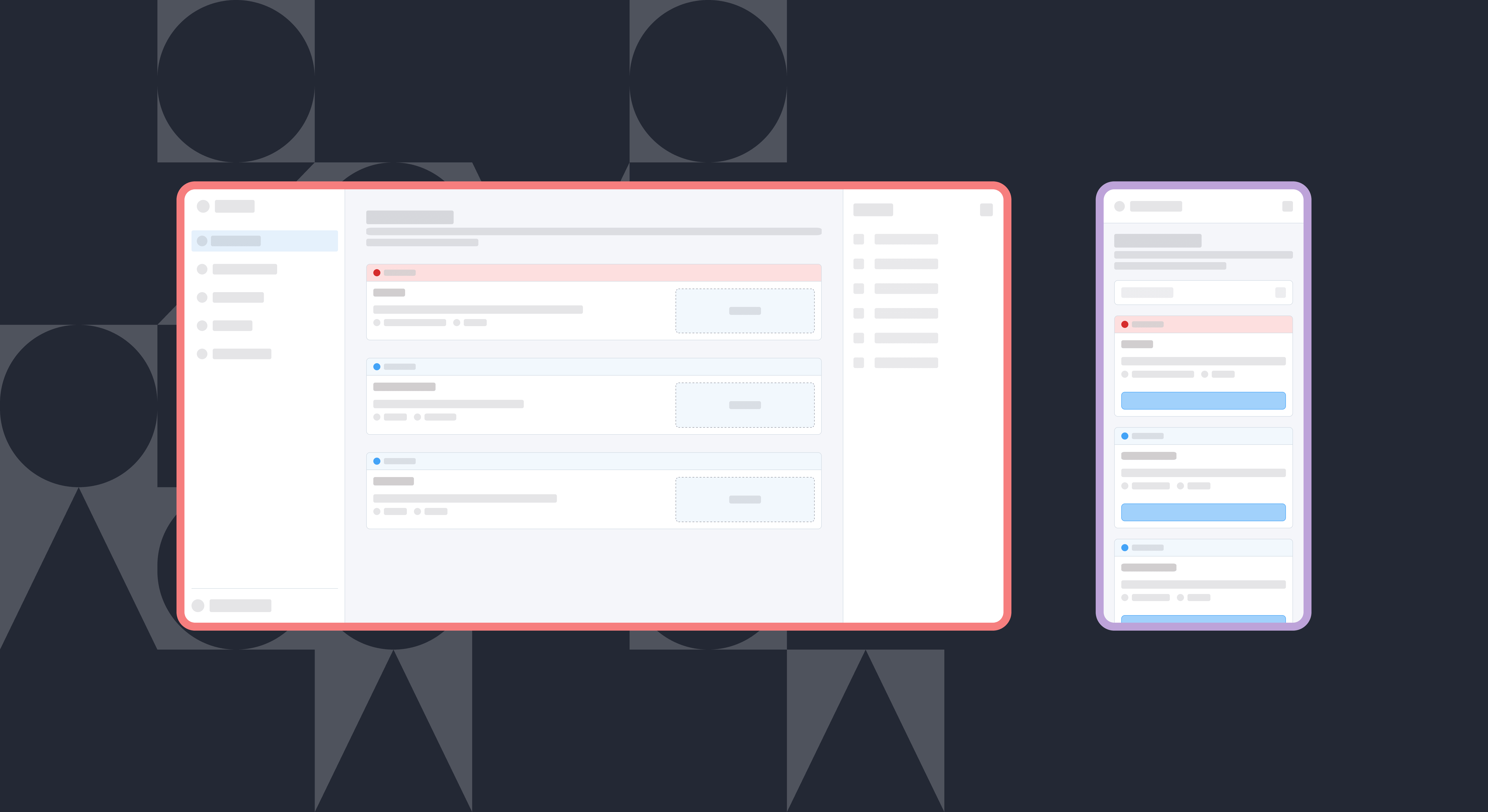
Instead of asking users to navigate relationships between loans, entities, and tasks, the redesigned experience focuses attention on the work that requires action now.
This approach:
- Reduces cognitive load by surfacing only relevant actions
- Scales naturally, from simple workflows (1-2 tasks) to highly complex loans involving multiple entities and stakeholders
- Delivers a cleaner, responsive experience across desktop and mobile
The result is a platform that supports complex commercial lending without exposing unnecessary system complexity to users.
Simplified Information Architecture
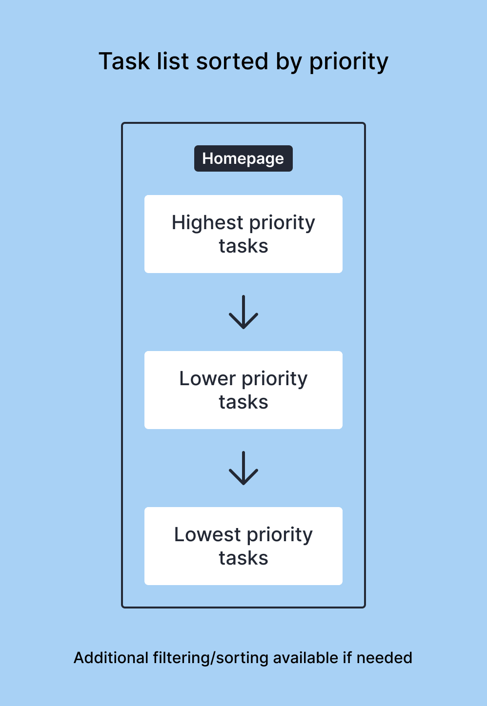
Task driven user experience, scalable to highly complex loans
- The applicant portal now supports complex commercial loan structures without increasing interface complexity
- The redesign established a scalable information architecture, enabling expansion into adjacent workflows such as covenant management, and helped unblock a $1M+ deal
- The redesign helped strengthen partner confidence, positioning the portal for integration into Moody's ecosystem following acquisition
- Enterprise products often need to balance perceived capability with operational simplicity
- Early prototyping creates a shared language for aligning stakeholders and refining ambiguous requirements
Messaging integration to improve collaboration across entities.
Further enhancements to reporting and task automation for complex loans.
