The Statement Builder is a core tool used by credit analysts to standardize financial statements and run scenario analyses. Despite its importance to underwriting, only 16% of sessions resulted in a completed statement, driven by a system that compressed multiple workflows into a single, overloaded interface.
In a high-stakes financial context, small errors in statement construction could result in misrepresented financial positions, regulatory risk, and loss of client trust.
Lead UX Designer
Research, prototyping, UI design
Expanding and maintaining our design system
Discovery & Redesign: 2 weeks
Initial Development: 1 week
Completion rate increased 3x
User engagement increased 87%
Task completion time reduced 50%
As a credit analyst, I need an easy way to transform financial data across periods and model future performance so that I can evaluate borrower health, assess credit risk, and make informed lending decisions.
Despite strong demand from customers, only 16% of sessions resulted in new statements generated. To understand why analysts struggled with the tool, I reviewed FullStory recordings of users interacting with the feature. These recordings revealed consistent confusion about where to begin and frequent abandonment before completing the workflow.
Original UI
.png)
Every user: Where do I start?
Research sessions with internal subject matter experts revealed that users approach the statement builder with specific goals in mind. Additionally, customers had new goals for the feature that weren’t currently supported, indicating the need to expand functionality to better meet these objectives.
Key Insight: The problem wasn't just complexity - it was also orientation. By combining multiple workflows into a single interface, users were often unsure where to start and had to mentally map the system to their goal before making progress.
That led me to three options:
Pros: Clear entry point, scalable architecture, flexible UI, and implementable within time frame
Cons: Requires manual input from analysts
Pros: Potentially minimal engineering work
Cons: Still mixes multiple workflows, increasing cognitive load
Pros: Automates part of the process based on configuration
Cons: Highly complex, less flexible, and not achievable within time constraints
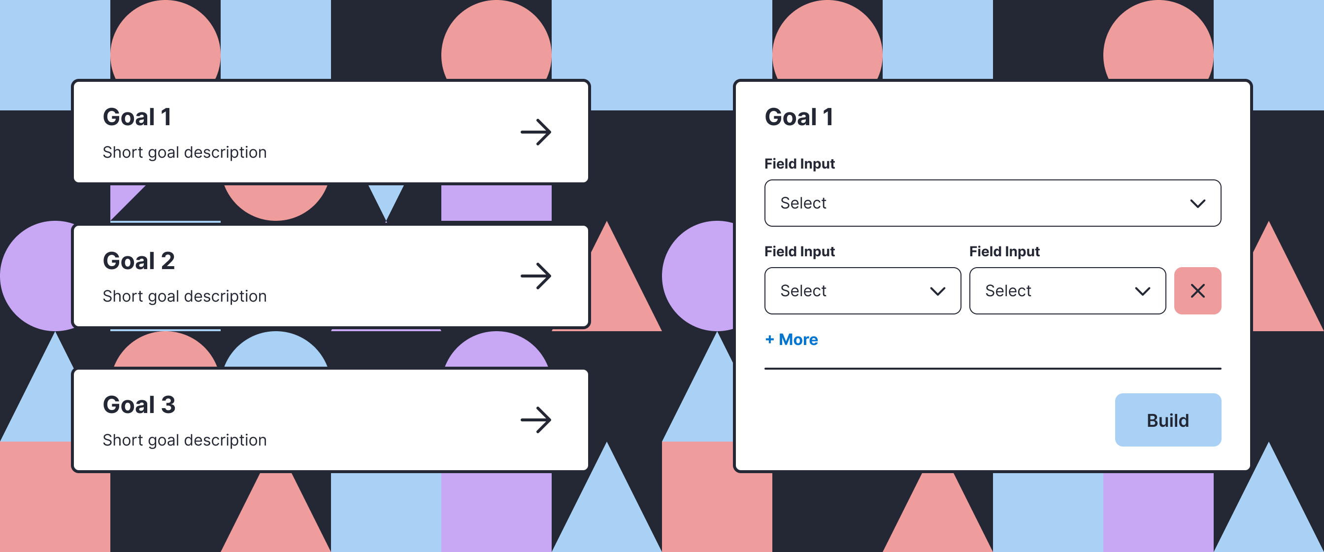
The redesign starts with one question: what are you trying to do? The answer determines the inputs, validation logic, and how data will be transformed, replacing a generalized system with task-specific flows.
Clear starting point: Instead of forcing multiple workflows into one screen, users now start by choosing their goal.
Reduced cognitive load: Each flow surfaces relevant options and contextual cues so analysts can recognize what to do next, eliminating the need for users to interpret how the interface maps to their task.
Scalable structure for new statement types: Working closely with engineering, we built and shipped the first two redesigned flows in one week, gathered customer feedback, refined them, and then expanded with additional flows.
New Goal Selection UI
.png)
Dedicated UI per goal
.png)
Analysts went from abandoning the tool to relying on it in production workflows.
16% -> 70%
Success rate increase
+86.56%
User session growth
2x Faster
Completion time halved
+2 New Flows
New capabilities added
Automation opportunities: Early exploration with AI shows promise for efficiency gains, but accuracy remains a top concern.
Usability testing: Success rates improved significantly, but more testing can uncover how to increase it further.
Technical Evolution: Future releases can evolve the validation system to improve usability Completed.