The Madison-Morgan Cultural Center is a non-profit, multidisciplinary performing and visual arts facility. The Center occupies an elegantly restored 1895 Romanesque Revival building located in the heart of Madison, Georgia's historic district. Their website generally has over 1,000 views per week.
In December of 2019, I was asked to conduct a heuristic evaluation with the objective of helping them decide whether or not they should redesign their website. After my evaluation revealed the need for significant improvements, we opted to migrate the website from Weebly to Squarespace and completely redesign the mobile and desktop experience.
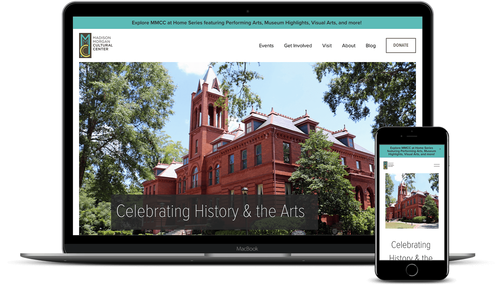
The website went live on June 27th, 2020 and can be viewed here.
The MMCAC staff are having difficulties maintaining and keeping their website up to date. They find it to be cluttered, incongruous, and an inaccurate representation of who they are. Most users are having issues easily finding events while new users are often confused as to what the Cultural Center actually is.
A newly redesigned website built with Squarespace that allows the MMCAC staff to easily add new events and create engaging blog posts while providing a more intuitive event organization for users.
My Contributions
Heuristic Evaluation, Content Migration Strategy, Card Sorting, Survey Construction, Data Analyst, Lead Designer, HTML, CSS
Duration
Dec 11th, 2019 - July 17th, 2020
Tools
Figma, Google Docs/Sheets, Miro, Trello, Squarespace, SurveyMonkey, Optimizely
Click a box to skip to a specific section or keep scrolling to start from the beginning.

Secondary Research Paper
Secondary Qualitative Accounts
Surveys
Affinity Mapping
Personas
Google Mapping Sheets
Problem Statement
Severity Ranking
Journey Mapping
Content Strategy
Prototyping
MVP
Usability Testing
A/B Testing
Usability Testing
|---------------------------------------------------------- 2 weeks ----------------------------------------------------------|
Heuristic Evaluation
Weebly Analytics
Survey
Card Sorting
Sitemaps
User Flow
Affinity Mapping
Content Migration
Content Strategy
Squarespace
Styleguide
Usability Testing
Google Lighthouse
|---------------------------------------------------------- 2 weeks ----------------------------------------------------------|
I based my heuristic evaluation on Jakob Nielsen's 10 Usability Heuristics for User Interface Design (learn more here). Below are my key findings. Click here to read my full report.
#1. Visibility of System Status: "The system should always keep users informed about what is going on, through appropriate feedback within reasonable time."
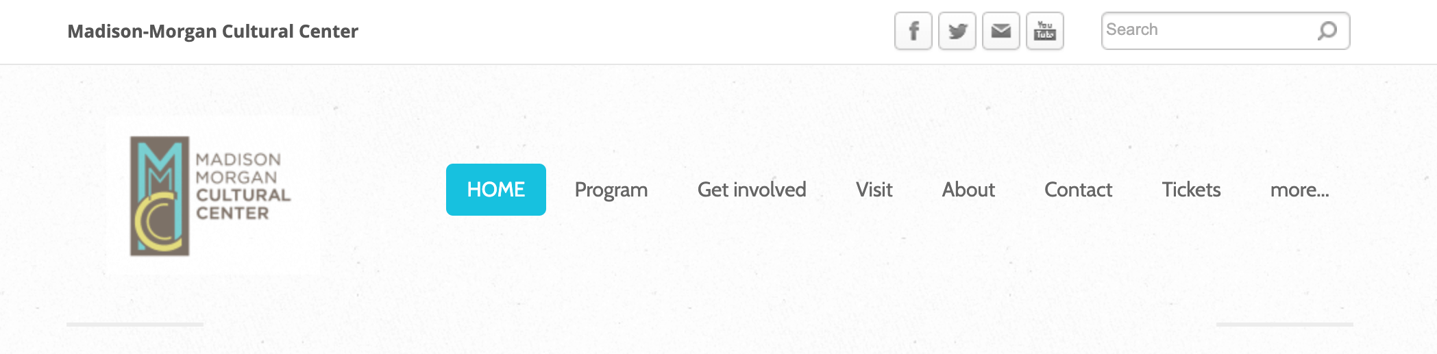
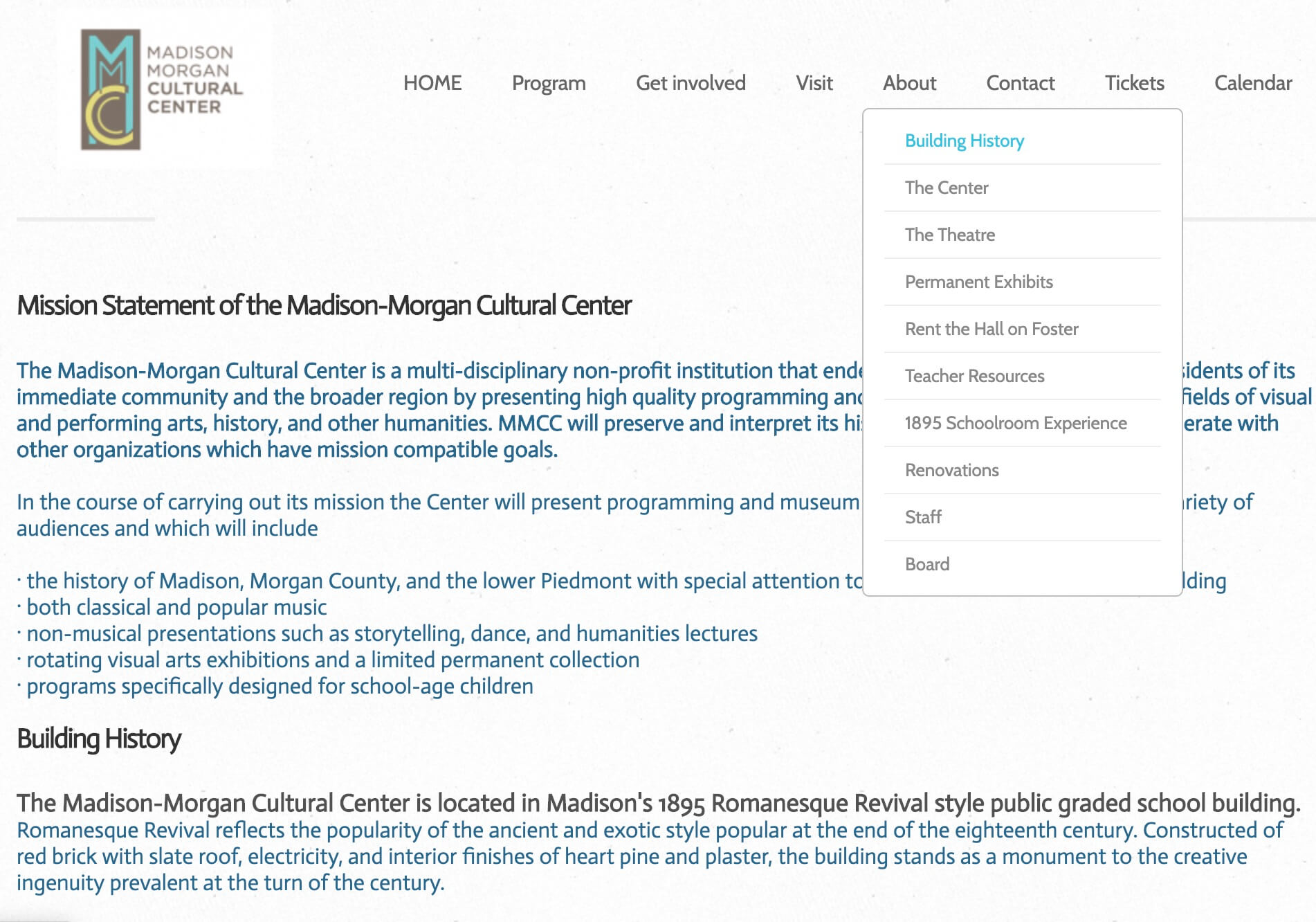
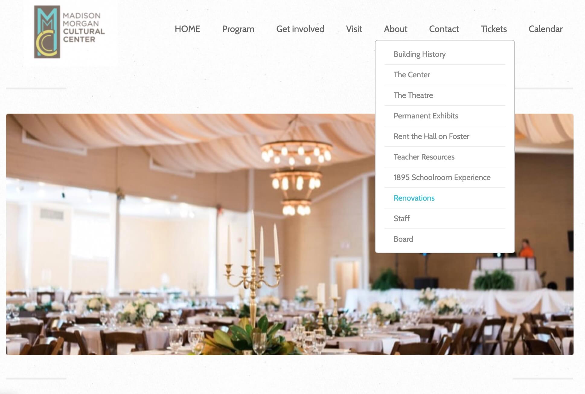
How it appeared on MMCAC's site: Pages did not always have clear headers. Clicking on "Building History" took users to a page with the header "Mission Statement." The "Renovations" and "Rent the Hall on Foster" pages both had the same hero image and "Renovations" did not have a header.
#4. Consistency and Standards: "Users should not have to wonder whether different words, situations, or actions mean the same thing. Follow platform conventions."
How it appeared on MMCAC's website: The overall design isn't very cohesive - margins, layouts, and colors are seemingly randomly applied. Each form on the website is a completely different design. The event organizational system does not match current conventions, and was found under the vaguely titled word "Program." Sometimes blue text were hyperlinks and sometimes they weren't.
#8. Aesthetic and Minimalist Design: "Dialogues should not contain information which is irrelevant or rarely needed. Every extra unit of information in a dialogue competes with the relevant units of information and diminishes their relative visibility."
How this appeared on MMCAC's website: Website analytics showed that the main reason people visit MMCAC's website is to find an event or information about an event. However, there were over 20 other pages that did not contribute to users achieving this goal.
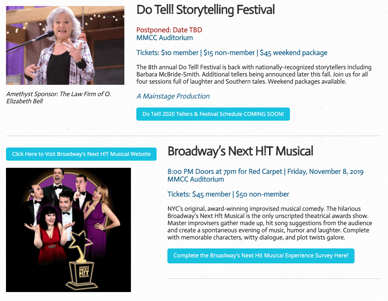
The example below shows a different way in which this heuristic was transgressed. 6 different font colors were used on one event page, each competing with the other for the users attention.
I also found that parts of the website were not up to date with current web accessibility standards. This is especially important because the majority of MMCAC's audience are older adults. Research has concluded that older adults find sans-serif fonts with high contrast easier to read. Most of the font was 16px or higher (except in the footer where it went as low as 10px) but all button fonts were 14px or lower and were low contrast.


MMCAC's website analytics revealed that people primarily use this site to look up events while a smaller percentage come to learn about the building, staff, and how to contact. The majority of their users come from Google.
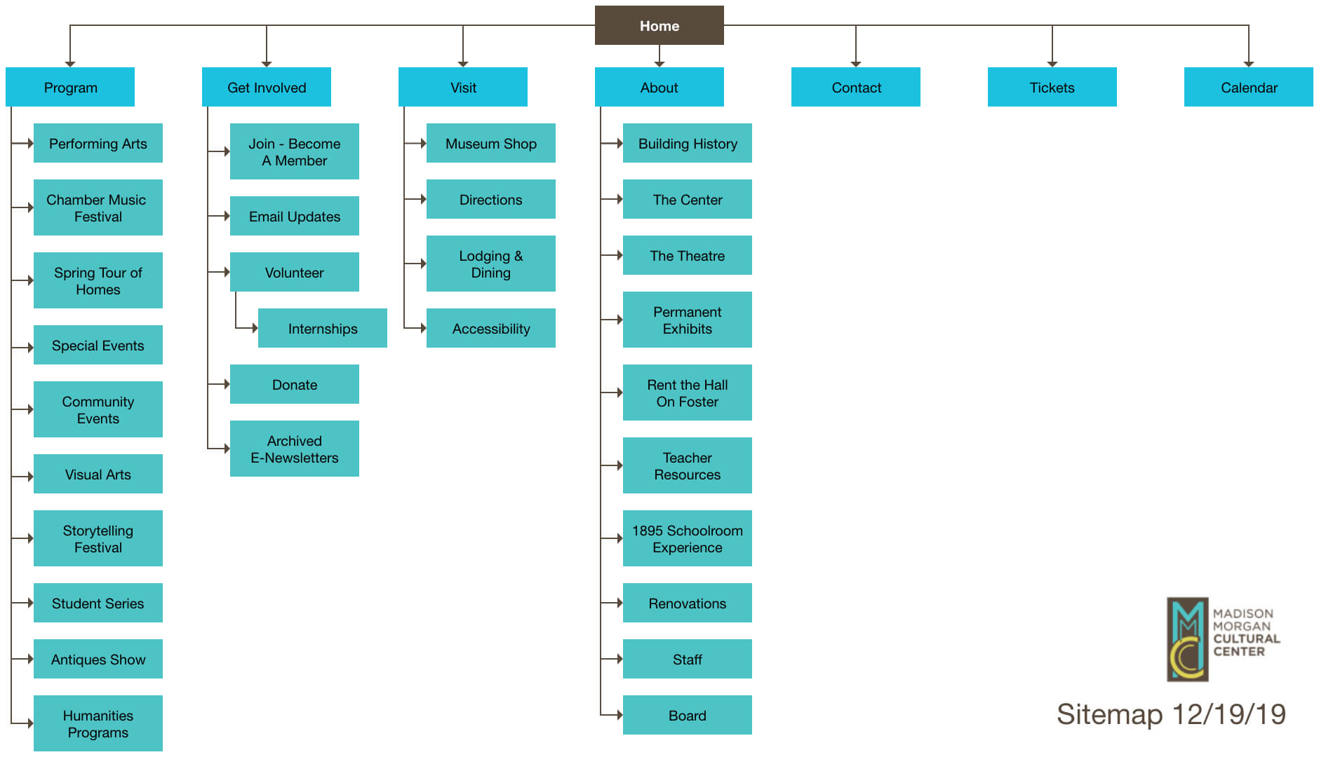
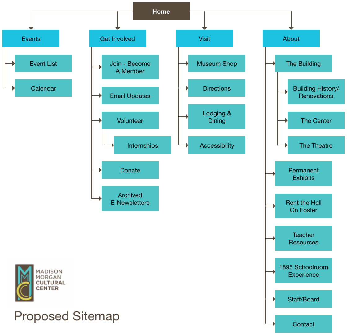
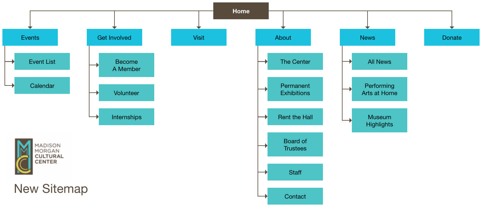
With these user goals in mind, I created two sitemaps that showed the current website navigation verses my proposed version. The third sitemap shows where we eventually ended up.
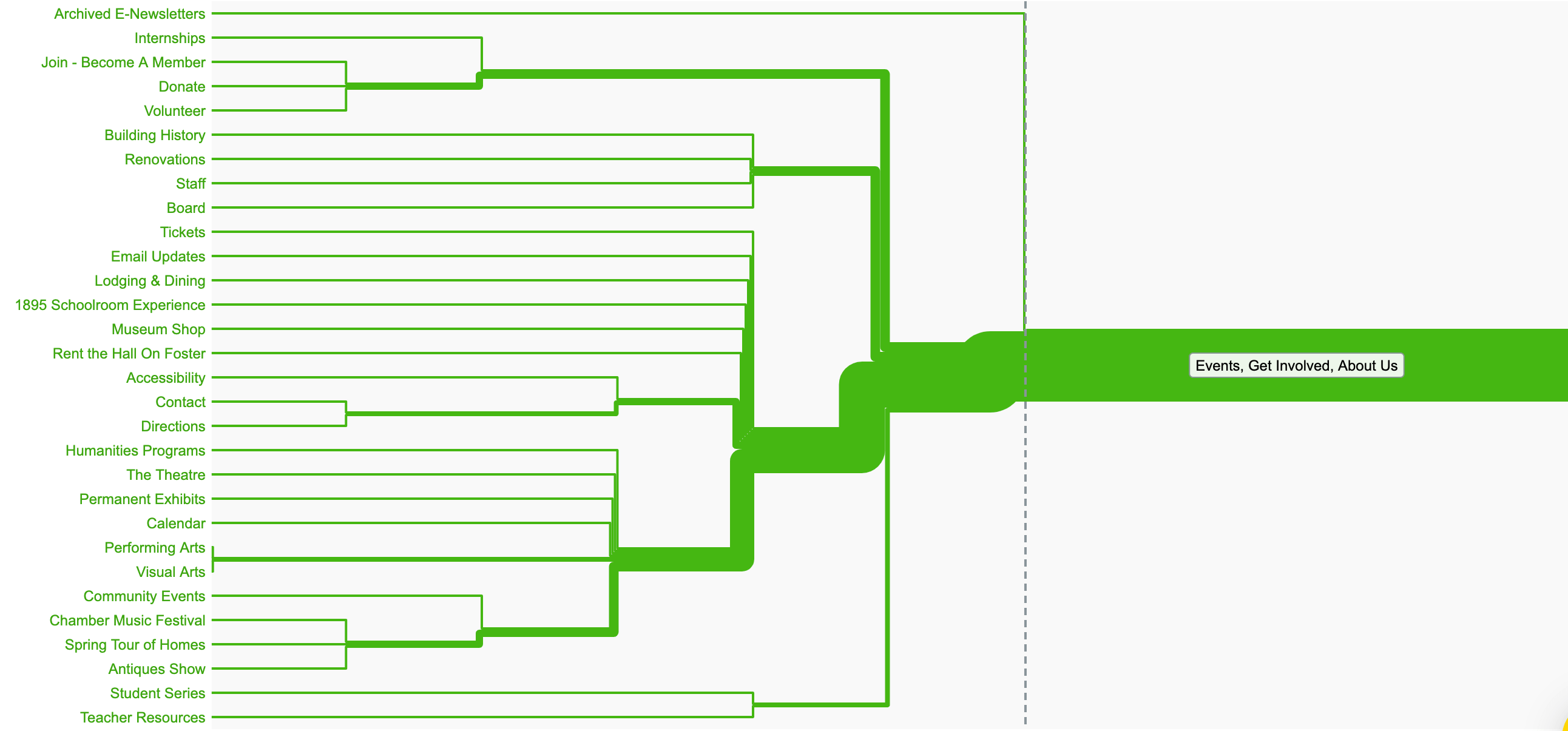
To prove whether or not my proposed sitemap made sense, we sent out a survey to current users asking them to evaluate the website. I also created an open card sort using Optimizely.
Survey feedback:
"Overall, the site does not seem to be integrated design-wise, but assembled of many pieces."
"It took a few more clicks than I would have liked to find the next event happening."
"[There are] too many different divisions for program listings."
"Confusing - way too much old stuff."
The survey received 8 responses and validated my heuristic evaluation findings. Most users thought the website was confusing and cluttered, and had a counterintuitive way of organizing events.
An analysis of my open card sort validated my proposed sitemap - the most popular categories were "Events," "Get Involved," and "About Us." User feedback also revealed that new users were confused as to what the MMCAC actually was. Multiple new users thought it might be an educational institution of some sort. Some eventually realized that it was an event space while others did not.
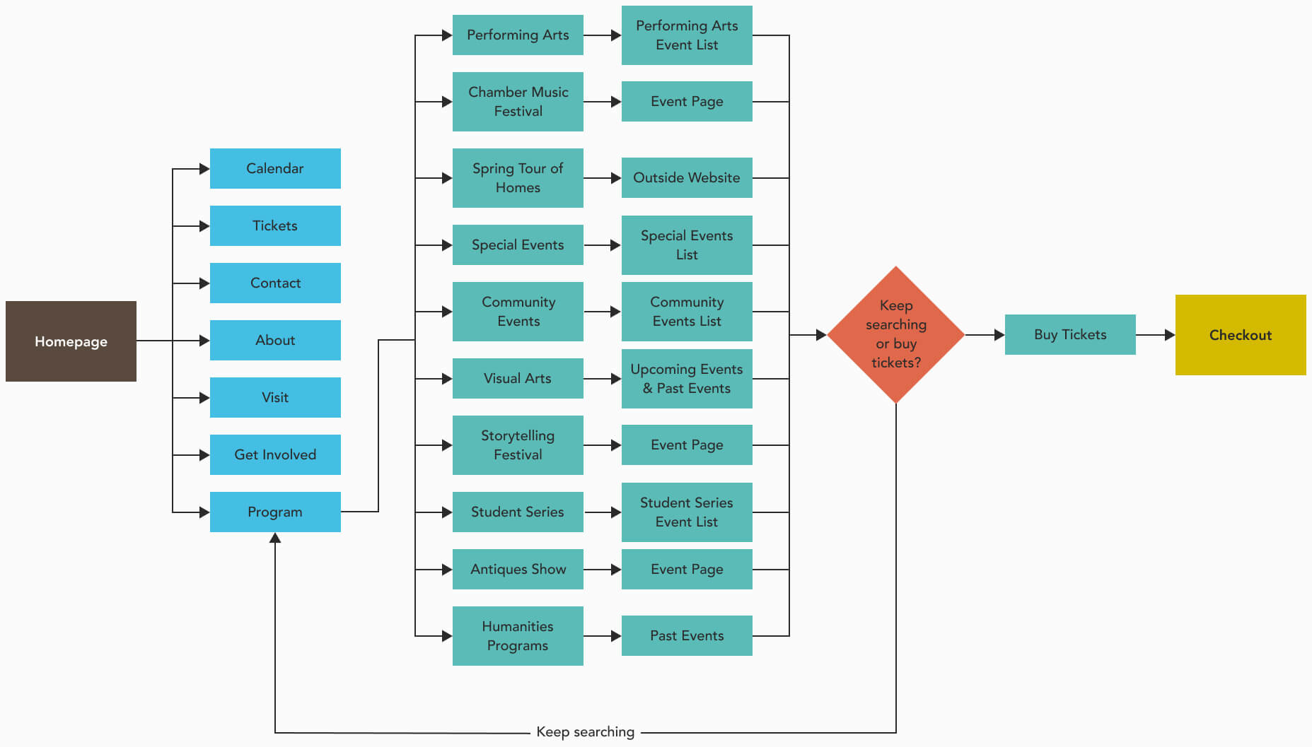
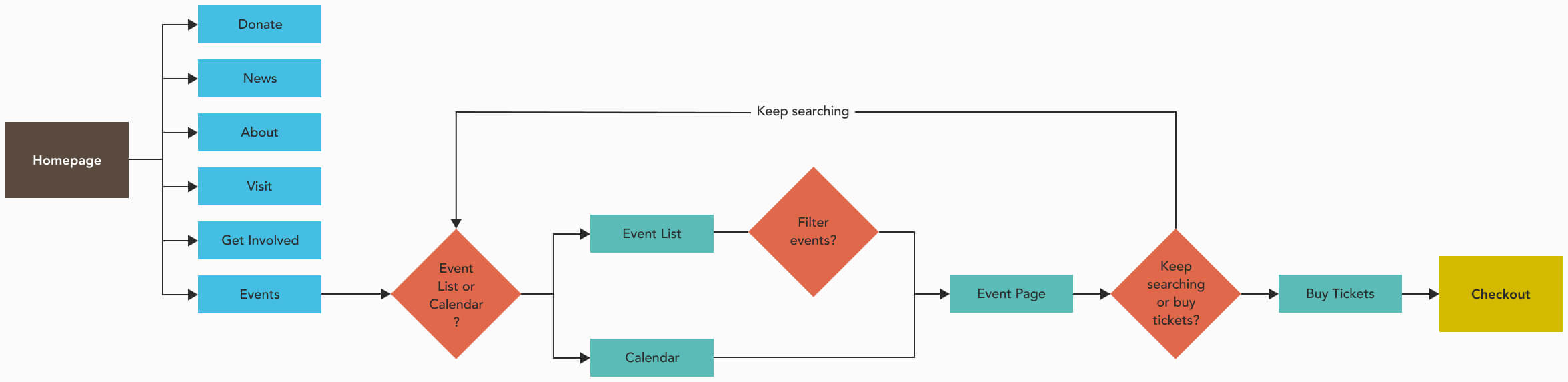
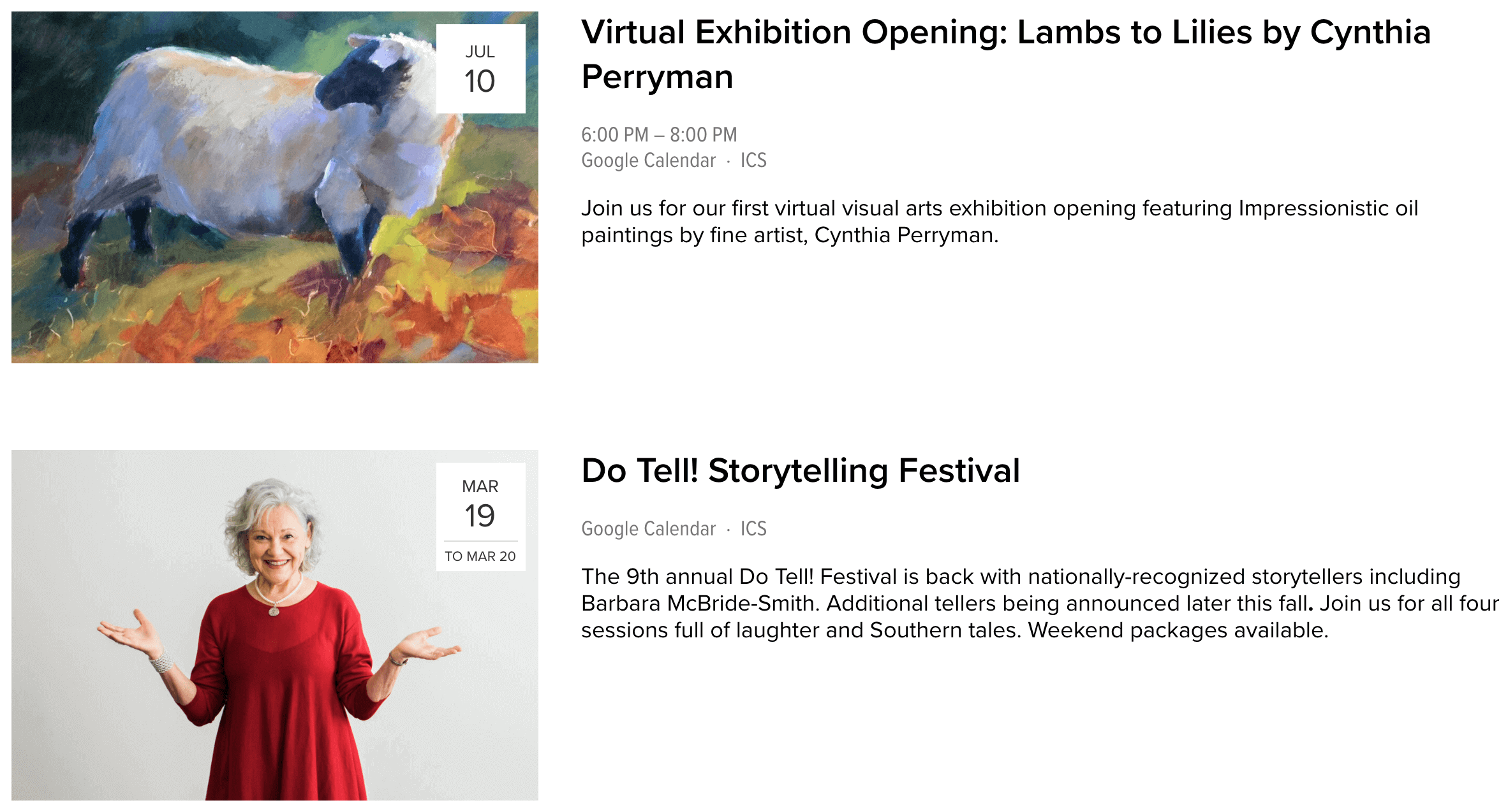
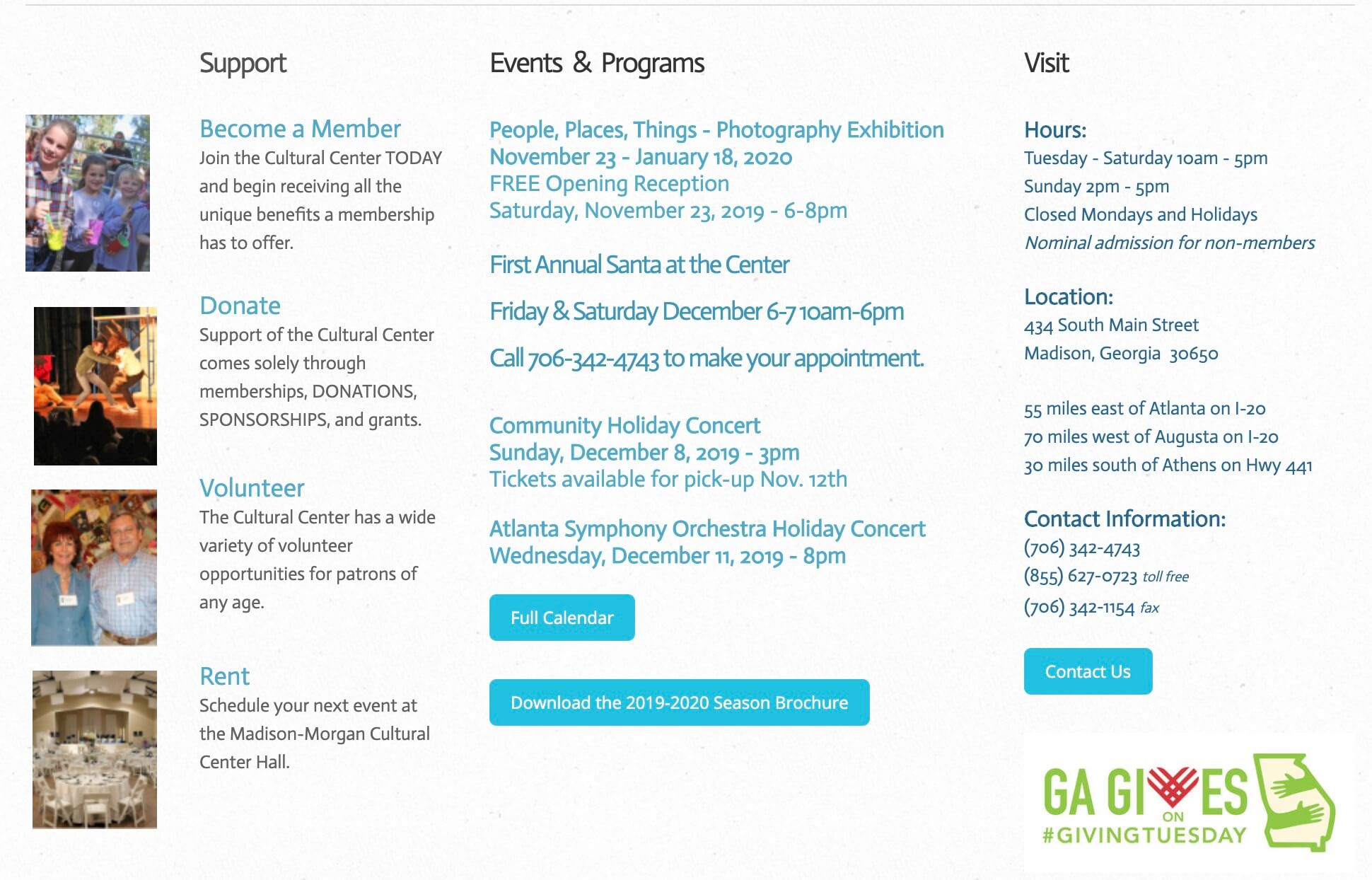
Keeping in mind what I learned in my Atlanta Symphony Orchestra project along with current event organizational norms, I created a new user flow diagram. Previously, users hovered over a navigation item titled "Program" which then showed them a list of 10 different types of events. These event categories used vague names like "Community Events," "Special Events," and "Performing Arts," which confused users and hindered them from completing their main task. My new version has no pre-made "program" divisions but instead allows users to view events through a calendar or event list page and filter from there if they wish.
To sum the problem up:
PROBLEM: The MMCAC staff are having difficulties maintaining and keeping their website up to date. They find it to be cluttered, incongruous, and an inaccurate representation of who they are. Most users are having issues easily finding events while new users are often confused as to what the Cultural Center actually is.
SOLUTION: A newly redesigned website built with Squarespace that allows the MMCAC staff to easily add new events and create engaging blog posts while providing a more intuitive event organization for users.
MMCAC's new website needed a few specific features:
After researching different CMS options, we concluded that Squarespace would be MMCAC's best choice. Even though it isn't the most customizable, it offered all the features MMCAC needed and the staff found it easy to navigate. It also allowed me to brush up on my HTML and CSS skills!
Now that we had our new CMS chosen and all of our survey, card sorting, and web data analyzed, I began developing a content migration strategy. I found the two most important tools in this process to be Google Sheets and Trello - these are both easy for people to sign up for and use, and they're helpful for keeping track of what needs to be migrated and how to accomplish this. Google Sheets was used to create a content inventory while Trello was used to keep track of our step by step plan.
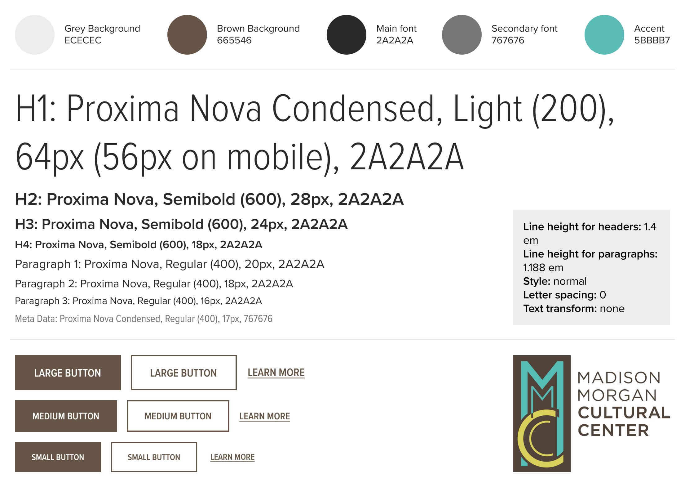
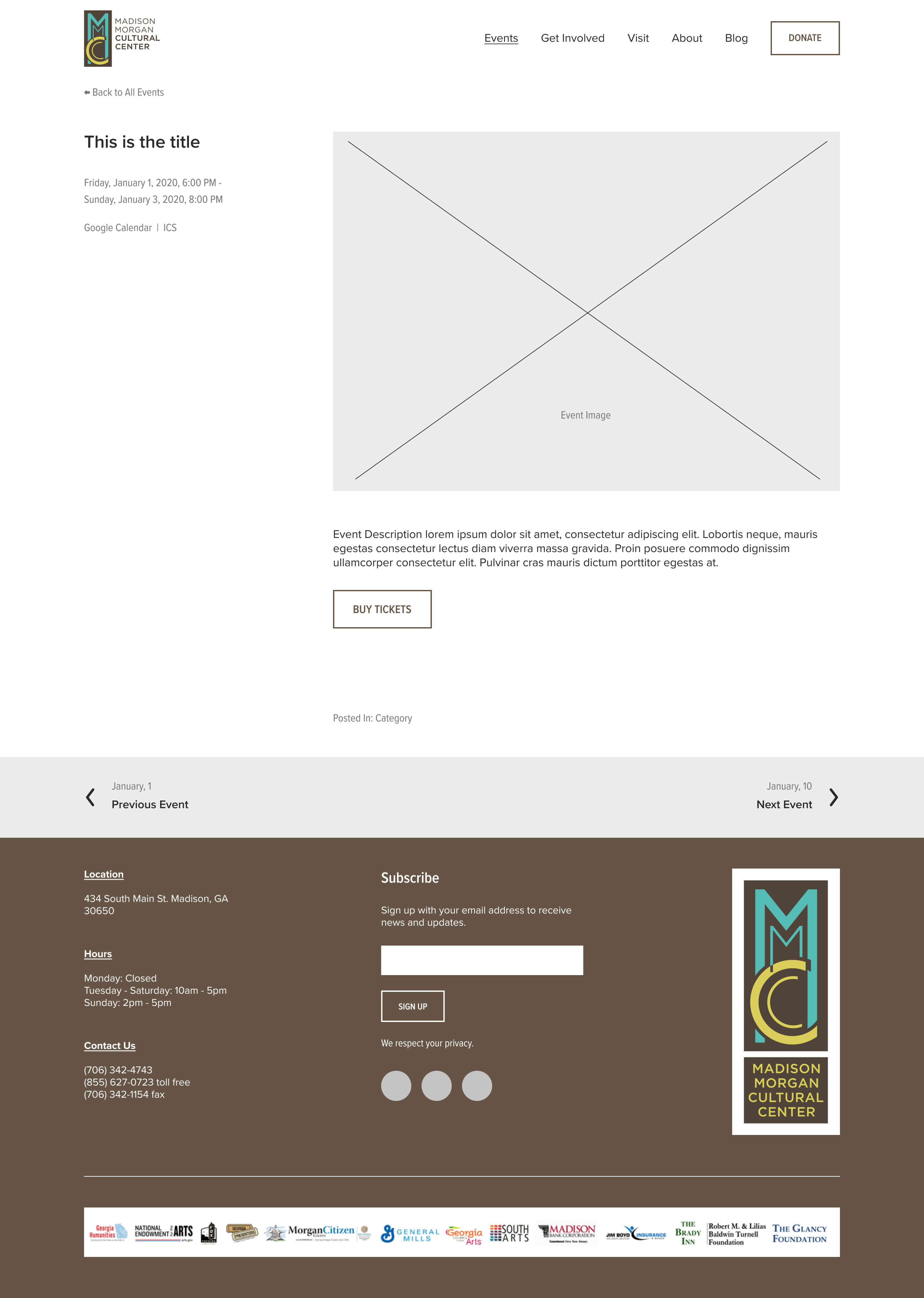
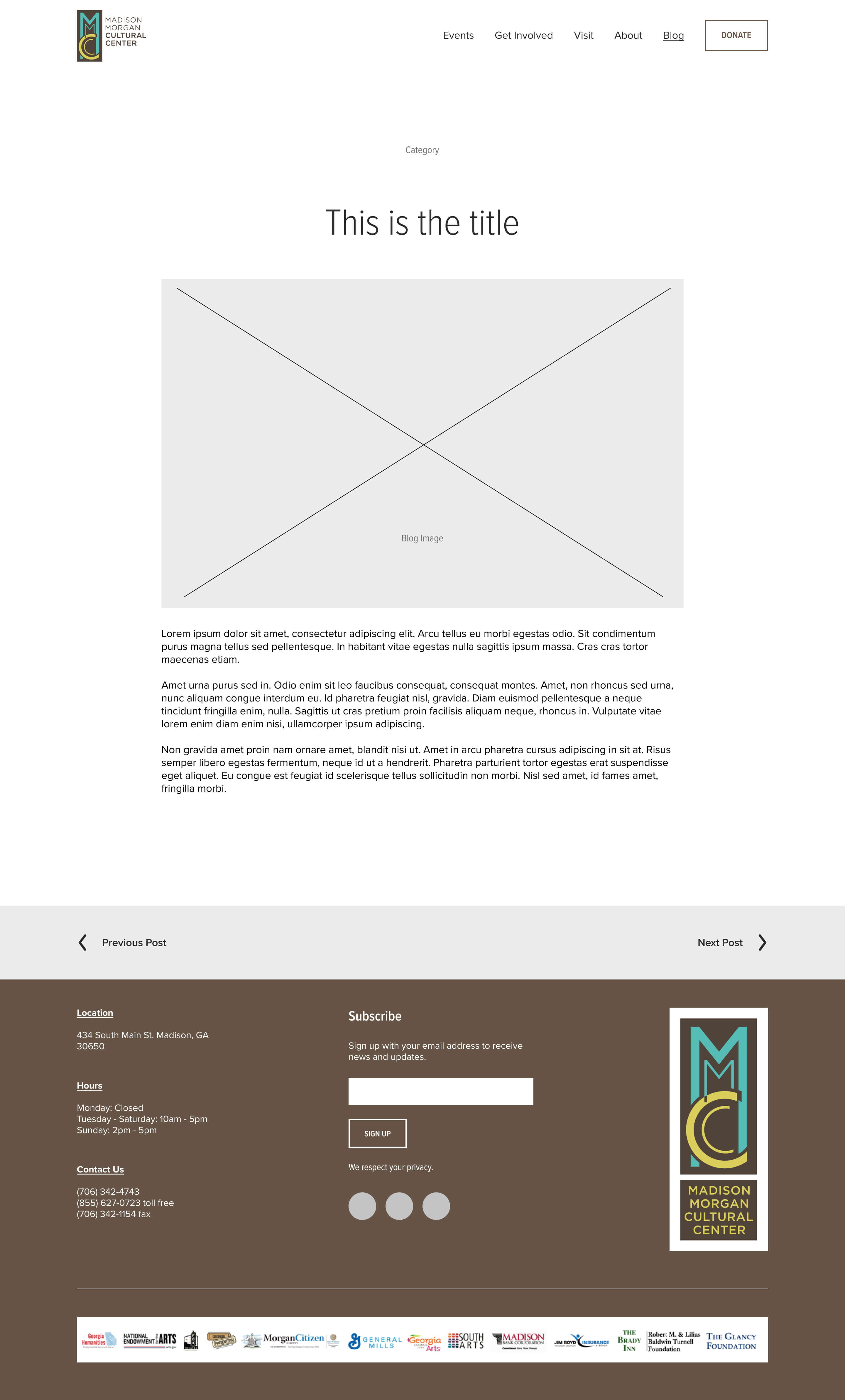
To keep our design cohesive, I created a style guide (pictured below) and templates for the two types of pages that would be duplicated the most: Event Pages and Blog Post Pages.
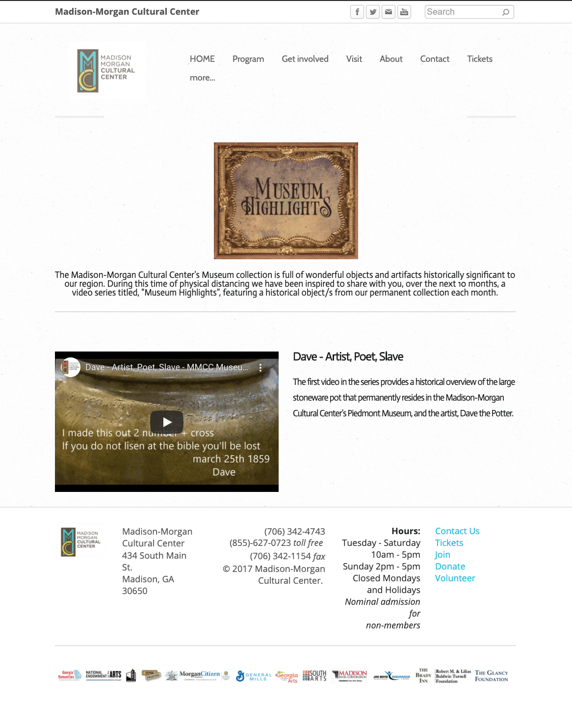
Pictured below are our templates for the Event Pages and Blog Post Pages, shown next to their previous designs. These can be quickly duplicated and updated when needed. Squarespace only allows minimal customization of these types of pages, but HTML and CSS can be used to unlock some additional design options.
Below are a few more comparisons between the old website and the new, including the new validated navigation.
While there were small details here and there that the staff wanted changed, the general consensus was positive.
"[The staff ] were all really impressed and so happy with the way the site looked and how easy and simplified it all felt. They love how the events are presented and the News feature."
And on the user side of things:
"I like the color scheme - it's pleasant and easy on the eyes. Easily readable."
"Attractive and easy to use."
"Webpage content is good and easy to navigate."
Usability testing revealed two main issues: First off, users wanted more information in the visit section - they wanted to know if it costs anything to visit the center, how much parking is available, and if the center sells food and drinks. Secondly, users found the news second difficult to navigate:
"I fell into videos and couldn't find a way back."
Initially, the news section was set up like the events section. Users clicked on news in the main navigation and were taken to a page where they could filter or browse all posts. However, users felt like they were randomly stumbling onto content they were interested in but didn't know how they got there or how to find it again.
My solution was to update the filtering options with more descriptive terms and add these as secondary navigation items under news. Another round of testing showed that my changes resolved these issues.
Additionally, I compared the first month of the new website's traffic (July 2020) to the numbers over the last couple months (during the pandemic) and before the pandemic (December 2019). Current traffic has compared favorably to December 2019 analytics, which is one of their busiest times of the year.
View the new website here.